THE MOCKERY JAGUAR’S NEW LOGO FACES
“What a joke” says one angry user: The controversial and intense mockery Jaguar’s new logo faces
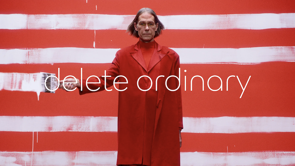
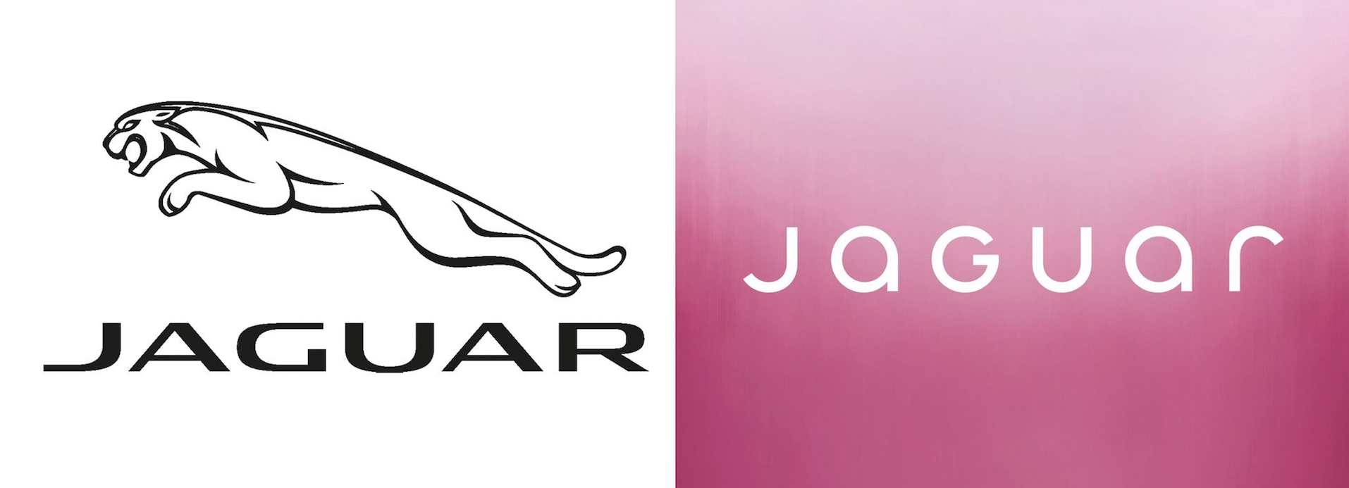
On Tuesday, a post on X, (formally known as Twitter), by 90-year-old iconic and luxury car brand, Jaguar, uploaded and shared an ad featuring models and stated: “Copy nothing”. The company says their new logo design and ad reveals ‘unique character’, and Jaguar’s chief creative officer, Gerry McGovern, states “It is imaginative, bold and artistic at every touch point. It is unique and fearless”.
BUT WHERE EXACTLY IN THE AD ARE THE CARS FEATURED? AND WHERE IS THE ICONIC CAT?
Social media users expressed their confusion and hatred of Jaguar’s new ‘modernised’ logo and advert: comments saying “awful, awful ad’ and another “whoever agreed to this needs to know they’ve just killed a British icon”. KILLED A BRITISH ICON? Damn, that must be difficult for Jaguar to accept. On the late night show with Stephan Colbert, he refers to logo as looking like “a luxury condom brand” compared to the old “badass kitty cat logo”. That’s yet another hard comment towards Jaguar’s new logo design. Even Elon Musk takes opinion in this harsh mockery that is rapidly spreading across social media, commenting on Jaguar’s post “do you sell cars?”.
So how exactly is the brand responding to this overwhelming criticism that’s taking over the internet? The boss of Jaguar has defended the controversial rebrand and said that he is disappointed that the marketing campaign had featured ‘vile hatred’ and ‘intolerance’, and that the ad was criticised as ‘woke’ when it was not intended to be, he says.
Despite all the disappointed responses, it was obvious that Jaguar had to eventually change their logo, I mean, it has been the classic 3-dimensional cat leaping in silver-grey since 2012. Even beforehand, from 1935-2012, they had only changed their logo 4 times. Beginning with the classic ‘Jaguar’ text in 1935, to introducing their iconic leaping logo in 1945, then in 2001 they gave the cat a more professional clean appearance. It was clear that they needed to spice things up and get back into the game!
Well clearly their ‘new change’ and ‘modernised design’ to their brand identity is becoming more of a design disaster!
Well, it is certainly understandable why people refer to it as resembling a logo of a “vegan smoothie company” or a “trendy underwear brand”.
IT LOOKS NOTHING LIKE A CAR BRAND!
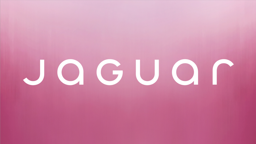
The design of the upper and lower cases adds a funky style to the logo, but it is far too simplistic which follows the ‘modern’ trend and their intention of appealing their brand to the younger generation. The logo overall does not resemble anything of a car brand apart from the obvious name of the brand in the center. Where is the iconic cat we all want to see?
Is this really a design disaster?
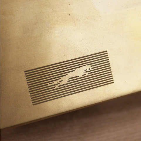
The company has also modernised the new-leaping Jaguar mark. Marina Hyde mentions in the Guardian that the firm claimed this ad announces its intentions to reach younger, richer people that it idealises as ‘cash-rich, time-poor’.
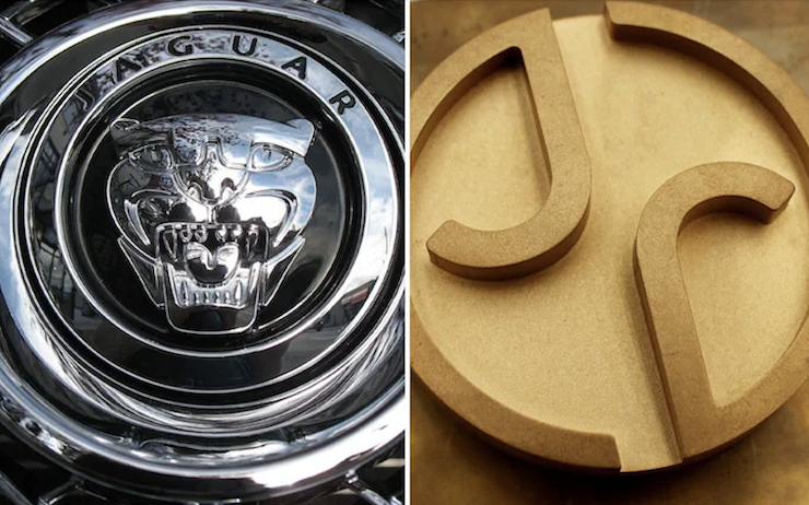
Their promotion of the new all-electric cars releasing in 2026 is more than double the price of their cars now, and it is evident through their modernised look they are trying to reach and appeal to the younger generation and abandoning its history of their iconic brand identity.
A drastic change from their past logo designs which were simplistic, clean, and yet effective in what the brand stands for, to now in the ‘modernised’ world of 2024. Their logo is boring, and dull and illustrates nothing of a car company. The audience was expecting more of a heritage look, but Jaguar is going in the opposite direction and leaning towards a more modern appearance: the audience is not happy!
MORE NEWS AND UPDATES BELOW
COMPLETE COURSES LIST 2026- 2027
SCHOOL OF GRAPHIC DESIGN
Graphic Design for Beginners Level 1
Graphic Design Level 2
Advanced Graphic Design Level 3
SPECIALIST DESIGN COURSES LEVEL 4
Advertising Design Level 4
Brand & Corporate ID Design Level 4
Packaging Design Level 4
Visual Communication Level 4
PROFESSIONAL + BUSINESS COURSES LEVEL 5
Creative Thinking & Process Techniques PL5
Creative Team Building PL5
SCHOOL OF TEXTILE DESIGN
Textile Design for Beginners Level 1
Textile Design Level 2
SHORT COURSES + WORKSHOPS
Introduction to Graphic Design Short Course
Logo Design Short Course
Creative Thinking Short Course
Become a Freelancer Short Course
Digital Illustration for Beginners Short Course
