
Google Redesigns Its identity, but how much did it change?
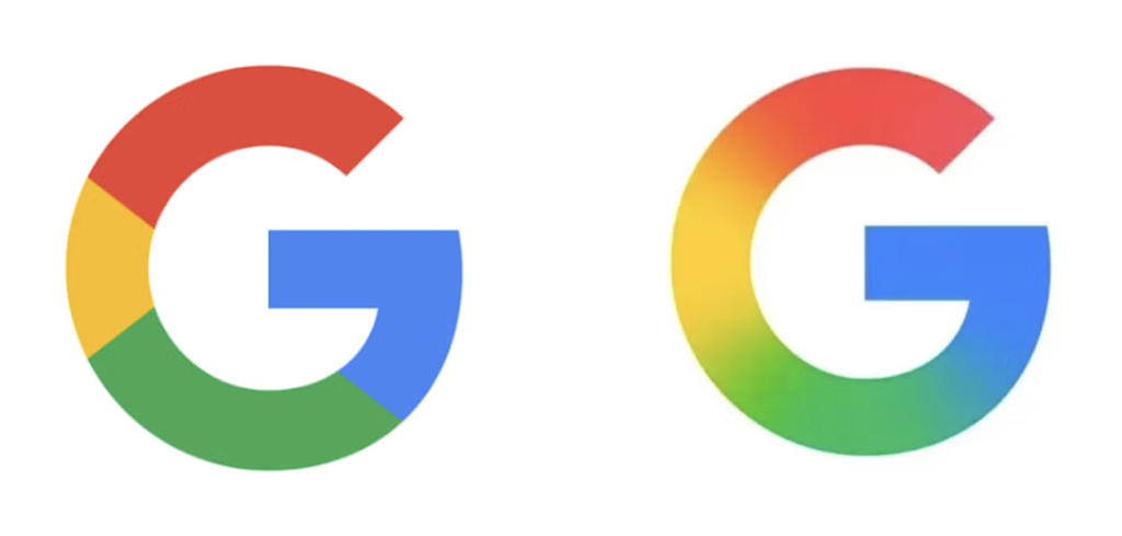
Design trends are constantly evolving, and it’s essential to stay informed about the latest developments as a brand identity designer. Recently, the well-established and influential brand ‘Google’ has updated its logo on iPhones and Pixel phones. This is the first time Google has updated their logo in 10 years, and it appears to be successful. The last major change Google made was in September 2015, when the company updated its font and changed the design to the iconic ‘G’. In 2025, Google changed the ‘G ‘in the app icon. It looks polished and much smoother. This gradient effect glides the eye over the fresh design, which instantly catches the eye. It is no longer the big chunky colour blocks – red, yellow, green, and blue.
There must be something in the air
Several big tech and digital brands, such as Amazon and Adobe, have revealed subtle tweaks to their logos this month. But why have such a big company made this subtle change to a logo when they have so many other logos like Google Ads and Gmail in the same brand system? This has me thinking, are they going to change some of the other logos to this new gradient effect? I think that changing the other logos to this new update will be a disaster. Despite the new Google logo looking more ‘modern’ and fitting into the trends of 2025, I don’t think all of their logos would look well with this theme.
Shouldn’t they try to stand out more rather than fitting into these trends?
Though some believe this subtle change was a great one, an online designer has commented, “As somebody who’s worked on several Google Hub brands over the years developing icons to fit in the style of the old G, I don’t get this. It just seems like bored designers and directors trying to justify their jobs by fixing something that isn’t broken and in the process breaking the thing they’ve been building their entire design ecosystem around for the past decade”. We can expect there to be more noise around this one as it lands on more home screens over the next couple of days. Unlike those subtle changes of Adobe and Amazon, this one’s going to be placed right in front of the audience. However, judging by the majority of responses, Google’s new gradient is a winner.
Where can I learn about brand identity?
At the Creative Design School, we offer a Specialist Brand Identity Course for graphic designers, employers who wish to increase the skills of their staff, or Design Agency employees. Within the course, we teach our students the most important elements when designing logos, which include the colour palette, imagery, and typography. As a new designer, you may question how designers create new logos from scratch and where designers take inspiration from. You will be guided step by step, looking at the world around you and how to capture inspiration aimed at developing your own unique approach to coming up with effective solutions for your clients or projects. This encourages our students to become trend setters rather than trend followers. This is what makes a brand identity designer successful in their career.
Join our community!
Link to brand identity course: https://creativedesignschool.com/brand-identity-design-diploma-course/
Link to all courses: https://creativedesignschool.com/our-design-courses/
MORE NEWS AND UPDATES BELOW
COMPLETE COURSES LIST 2024 - 2025
SCHOOL OF GRAPHIC DESIGN
Graphic Design for Beginners Level 1
Graphic Design Level 2
Advanced Graphic Design Level 3
SPECIALIST DESIGN COURSES LEVEL 4
Advertising Design Level 4
Brand & Corporate ID Design Level 4
Packaging Design Level 4
Visual Communication Level 4
PROFESSIONAL + BUSINESS COURSES LEVEL 5
Creative Thinking & Process Techniques PL5
Creative Team Building PL5
SCHOOL OF TEXTILE DESIGN
Textile Design for Beginners Level 1
Textile Design Level 2
SHORT COURSES + WORKSHOPS
Introduction to Graphic Design Short Course
Logo Design Short Course
Creative Thinking Short Course
Become a Freelancer Short Course
Digital Illustration for Beginners Short Course